Earlier today, Google released an update for its Keyboard app. That update adds a Material Design UI to the Google Keyboard.
Called Google Keyboard 4.0, this new update gives users two themes from which to choose, including:
-Material Light
-Material Dark
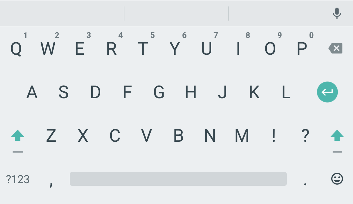
You can guess what each theme looks like. One is going to be light and the other is dark, like so:
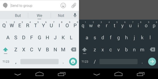
These are the same keyboard themes we’ve seen on early promos for the Nexus 6 and Nexus 9, so they should look familiar. The keys are noticeably flatter than the old design. In fact, the keys have been removed altogether! Google has eliminated lines between keys, so all you see are the letters. Personally, I think it looks pretty good. Very minimalistic.
The latest update should download automatically. Otherwise, you can go to the Play Store to download it yourself.
Once the update has downloaded, you need to go into Settings to change the theme. The actual functioning of the keyboard hasn’t changed much, although the facelift does look good – especially if you just installed the new Google Messenger app with Material Design.
Even guys with a Samsung Galaxy S5 like me can enjoy an Android 5.0-like experience thanks to all the Material Design apps Google is releasing!
Most Android users seem to be liking Google’s new “Material Design” theme. Material Design uses flat, square buttons and softer, pastel-like colors to give apps an elegant look.
Some people say it looks a lot like iOS, although I don’t really think that’s true. You could say the same about every mobile operating system out there today and find comparisons, so I think Google pulled off something unique.